Northern Health websites now mobile-friendly with responsive design
In 2016, which feels like an eternity ago, the Northern Health web team embarked on what became a three-year journey of enlightenment as we moved all the external websites over to a new and mobile-friendly platform called Drupal.
The entire project actually began several years before when it became obvious that we needed to make some big changes to our public-facing websites. They weren’t keeping up to the rapidly growing mobile world and didn’t work very well on mobile devices.
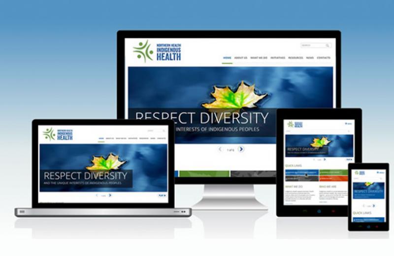
Drupal has been around since 2001, but our team had never worked with it. To familiarize ourselves with this framework and technology, we set out a pilot project: developing indigenoushealthnh.ca on Drupal 8.
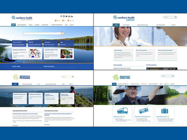
After the successful launch of the pilot in early 2017, we moved ahead with the daunting task of bringing all our existing websites over to the new platform. After dedicating many hours and conquering steep learning curves, we launched the first two sites, northernhealth.ca and careers.northernhealth.ca, in the summer of 2018. Physicians.northernhealth.ca and nhconnections.ca followed soon after in early 2019.
Accessibility
The old websites were not accessible to visitors with disabilities, especially our aging population. A website is accessible when its content is available to everyone, regardless of any visual, auditory, cognitive or motor impairment. BC is expected to introduce legislation on accessibility in 2024. We’ve been proactive, working towards having completely accessible websites when the legislation comes in to place.
Some of the changes we’ve made to make the sites more accessible are:
- Larger font sizes.
- Colour combinations that work for colour-blind visitors or visitors with aging eyesight.
- Coding in the backend that lets blind or visually impaired users listen to the page using a screen reader.
- Making sure someone can navigate the site with just a keyboard.
Mobile-friendly
All of the new websites are fully responsive, meaning whatever device you’re viewing it on, the content will flow and adapt to fit the screen. On a desktop computer the display may have three columns across the page where on a mobile phone the display will flow into one column.
We now proudly have more visitors accessing northernhealth.ca on a mobile phone or tablet than we do on a desktop computer. For example, in May of this year, 116,390 people visited northernhealth.ca: 85,871 of those visits came from mobile phones and only 21,030 from desktop computers, with the remaining 9,224 visits coming from tablets.

While we celebrated and embraced these mobile-friendly, ascendible “new arrivals” like loving parents, we secretly knew the real work was just about to begin!
Improved experience
Another important reason for making these changes was to update aging site content, much of which was out-of-date, hard to navigate, and not focused on what our visitors or patients required.

We needed to create an easier way for visitors to find the information they require. We dedicated a lot of time to simplify the menus and make information easy and intuitive to find. All of our facilities are now available from the “Locations” tab on the main navigation menu.
The NH Communications team also worked with the Patient Voices Network in the areas of Mental Health and Substance Use, Home and Community Care, Chronic Diseases, and Primary and Community Care to find out what information patients want to see on our website and how they can find it easily. We have endeavoured to make sure this information has been presented in the best way possible.
We’re also working to ensure the content on our sites has been written in plain language, which makes it easy to read and understand.
If you have any questions or feedback about the new sites, please don’t hesitate to contact me or Rosemary Dolman, Regional Manager, Web Services.


Comments